Monday, June 3, 2013

Returning home

This time I decided to do a landscape rather than a portrait. Since I have never done a color landscape earlier, I decided to take a tutorial for it. I searched YouTube and found a tutorial of a beautiful sunset. I must say, it has not come exactly same as the original. The reason for it is the difference in medium. The original painting is done in Oil pastels and mine is in pencil colors so the lines are going to be visible unlike the original.

To my surprise it took me less than 2 hours to finish the drawing. I could have finished it within the hour but for the tree, as the background was done in only 15-20 mins. 
I liked the idea of finishing a drawing so quickly, most of the time is saved in doing the outline. I am definitely going to try a couple more. 

The background is done in pencil colors and the trees, birds and hill in black sketch pen. I should have used black ball pen for the birds for them to be more defined. But for now this will do :)


Friday, May 17, 2013

A Drawing Gone Bad!

I guess this is a one of a kind experience. Tried a couple of new things and badly failed. I mostly do portrait kinds of drawings and am thinking of doing a scenery. So, I decided to a portrait which has some nice background, to start with. I am not going to upload the original picture as it is going to only remind me how different this one has turned out from the original. For starters here is the rough sketch i did, and it still looks very much like the original.

  
 Unfortunately, as and when i proceed the dissimilarity increases. The original picture is taken in bright sunlight and gives a brown shade to her hair, which is why the yellowish brown on the right side of her hair. 


Adding tones to the hair, darkening it, giving subtle details to mouth and teeth. Blended the face. And now its started to look real, with little more work on the eyes. I am using Prisma colors to attain the darkness of hair. Applied color to the neck area, defining the two lines.


Some more detailing of the face. Used blacks from some local brands to achieve a lighter shade of black, for the mouth and highlighted the pupils. I keep adding color to the pupils as the drawing progresses, to make it stand out from other dark shades.


Now moving to the sweater. As the sweater is black and white in color, I have to keep coming back to the and the eyes to match the darkness of the blacks in the sweater.


This is when I realize that I am not going to be able to achieve the sun effect on the hair and go ahead to darken it completely and finishing the sweater. I have also done some of the the background.


At this point, I am so unhappy with the background that I contemplate leaving the background at this stage and just finish of detailing the picture. Here is the completed picture.


I ended working just a little more detailing, so the final work. All framed up and onto the wall. To be replaced by a better color drawing in the future.


Monday, February 18, 2013

The Secret Project

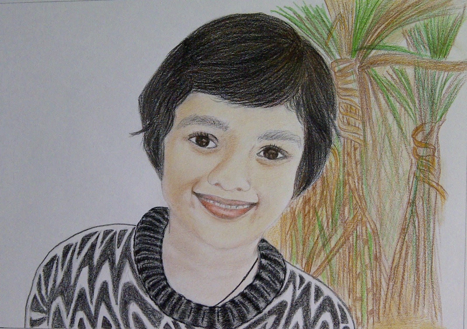
After contemplating quite a few Valentine's day surprises for Vivek, I settled on making a portrait of his. To be quite frank, this whole blog is result of that. Since, I had not done anything for more than 2 years now, i decided to do a test project first, so I ended up drawing my own picture.

It took me a a good 2 hours to settle on this specific picture of Vivek  I love the aura and his royal look in this one! And it seemed quite challenging too, believe me it was! Since this was a suppose to be a surprise, I worked on it in office for a while in between work and it took me slightly more than two weeks to finish it.


I had a sheet out of my sketchbook, and had to roll it to get it to office without spoiling it, so, the pictures may look a little skewed. Here's the outline sketch.


Starting from top to bottom and left to right, done shading the upper most part of the turban, you can see the considerable difference in the look, before and after I have smudged it with an ear bud 


Then, I reached the stage where the shading for the left side of the turban was done and I couldn't make out how to do the diamond effect on the turban, which was actually a thread work in the original picture. I started to do it with pencil and realized it becomes darker than the rest of the turban while it should be lighter, so tried an eraser instead and it worked!


Finished that on the left of the turban, and the upper flap, moving to the stones.


The stone is done, finishing up the right side of the turban, I was not as satisfied with the right side even till the end. But it was doable, so I let it be and it was a little tedious too.


I decided to finish the pearl string and again it only became darker than the turban rather than light reflecting erased it off and decided to work on it later.


And now, for the stone line at the lower edges of the turban and I shall be ready to start with the face.
  

The stones line on the right side done too. Starting with the face, I actually did the eyebrows quite weird. Was happy with the glasses over all, only I knew I had to lighten the edges later on. And at this stage it has started to look like Vivek :) This is all, I could do in office and it was already 12th, I had another 2 evenings to go and it was getting even more difficult to finish it on time. I decided to take it home and show it to him so that I could finish the rest peacefully.


There is a lot of work done between these 2 images. I have fixed the eyebrows, finished the rest of the face and moved on to the Kurta. I know, I am going to have to come back to the eyes and the chin at a later stage. I liked the Kurta even at this stage with just this much done.


So now that the Kurta was getting intense and a lot of graphite was going to be applied, I decided to finish all the touch ups to the turban and possibly the face too. I was very happy with the final look of the turban.


This is where I stopped on the 12th night. Leaving the rest to finish on the next evening.


And here is in between the Kurta.Fixed the chin and other shading on the face.


Finally when I thought it was done, took pictures, was already 12 in the night. Went to bed and uploaded to Facebook from my iPhone :)


But, apparently, I was not done. I realized the right eyebrow was way too curved. Removed the pic from Facebook, went back to my table, fixed it took pictures and uploaded again :)


I am going to trim the edges of the paper and draw a nice rectangular border to the image and frame it tonight. Will post the pic later :)

Here's the portrait framed :)


Monday, February 11, 2013

A Lovely Baby

I somehow end up loving my nieces much more than my nephews! I find little girls very cute and loving and also befriend them much faster than boys. I love all the cute little accessories, shoes, dresses that i can buy for my nieces, so whenever there's going to be a baby in the family, i wish for a girl :)

I have 5 nieces in all, combined from mine and my husbands families and much much more nephews! That makes the nieces even more precious. Its lovely to see them grow ,how, suddenly they start taking interest in fashion and those little appreciation that fly towards you about your new top or the new shoes or how nicely you have decorated something! So this post is about my youngest niece who will turn 1 in April :)

Although we are living continents apart whatsapp and facetime have made it easier for us to see her grow. It is surprising and overwhelming to see such a miniature version of ourselves doing all those baby things. Kind of emotional too. She has just started to stand and although my sister in law sends us loads of pictures and videos of her's we still crave for more. Its such a treat to see her laugh, make funny noises, we make those funny noises with her, her short attention span, her happiness when she is able to stand on her own! Its amazing! She doesn't walk yet only stands on her own, once she is on her two tiny feet she starts to jump in ecstasy not realizing she will fall immediately. Her mom- +Jaya says, now that she can stand, she wants to sleep while standing too!

I did the outline and decided to work top to bottom and left to right, so the first thing to do was the cover and when i was was done with the shadows on the cover, i realized its not looking well enough. It doesn't have an effect of the light and its looks as if its Grey scale! I think i should have done the shadows in pink or light orange.


Working on the rest of the covers i am satisfied with the pinkish red checks and the tiny flowers on it. I think the most important part is to get the face right. If the face comes lovely enough our eyes not going to wander of to the rest of the picture :)


Now that I am working on the face, it looks like the chin is too dark already but maybe I will be able to blend it well with the rest of the skin tone.


Its been long time due since i updated this one. I finished the drawing finally after and hour and half's more work. There is a visible difference in the darkness of the colors as I moved from some local color pencils to Prismacolor pencils. I am still continuing to use the old ones too.  The white cable in the below picture is charging my phone from which i am taking the picture and ideally this shouldn't happen!


Now time to darken the tones and finish the drawing. I should have taken a couple of more pictures in between these too stages but i was so eager to finish and see the end result that i simply forgot. Here's the completed pic.


 Framed up and ready to go on the wall along with other 3 drawings.


Wednesday, February 6, 2013

Color Pencils! I love them!

Over 2 years ago my husband, then fiance`, gifted me a wonderful Sony Vaio laptop to help with our long distance relationship :)  He is in a habit of adding a goodies bag along with his gift with some tini-mini stuff, he knew I loved to draw, so that bag contained a pack of 12 pencil colors along with other things. So these were my first ever pencil colors and I didn't know what to do with them.

Out of my love for him and putting a good use to his gifts I did a random drawing on the first page of a drawing book that my sister had gifted me.Remember, how we used to do a "My Art book" drawing on the first art class in school. After that the colors were more or less forgotten. Now, on my last birthday, he gifted me a pencil drawing set which had a nice assortment of graphite pencils, the kinds I use, colored pencils and some other drawing tools. These colored pencils I put to use for decorating the scrap book I made of our Thanksgivings vacation pics. That is essentially the only experience I have with color pencils.

Day before yesterday, I was checkout pencil drawing tutorials, tips and techniques, online and I came across a couple of color pencil drawings and I was immediately attracted to the idea! I really love colors in general, I like to keep things a little colorful, it is my way of keeping my life colorful :) Vivek  had always been insisting that I try doing the drawings in color but I wasn't confident enough.But, I read through a couple of articles defining techniques in color drawing and I printed out a photo of Taylor Swift. I was pleasantly surprised with the outcome! I did not expect it to be this well a drawing in my first attempt.

So here I go, starting with drawing the outline. 


After I was done with the outline the real dilemma began. At this point I was very confused as to which color to apply as the background of the face as I had only the basic 12 colors and nothing to go for the skin shade. Had it not been for Vivek, my drawing was ruined. I was about to apply a very light shade of brown. When I told him that, he said that mostly the base is done in light orange. Sometimes, I feel he is more knowledgeable about drawing than me! So, here's how it looked after a light wash of orange. I left out the eyes and lips and covered all the skin in light orange. I then used an ear bud or Q-tip to blend it, so that the fine lines would be gone.


I have one regret about this drawing, not having a proper shade of yellow and only one shade of brown has made the hair look quite different from it should have been. All I had was a lemon yellow shade and dark brown. I moved on to the eyes and the lips and from here the drawing starts to look realistic. Its the eyes, I guess.


 I started to darken the shadow areas in pink and blending with the ear bud all the time.


Yes, I had the original picture open on my laptop all the time. It really helps! For a while I just continue to darken the pinks and using a little black for the lips and teeth.


This is where I stopped working on it. It was almost 3 hours and this is all I had achieved. I supposed had it been a graphite one, it would be almost done. So here's the thing, color pencil drawings take way longer than the graphite ones. Almost more than double the time, and obviously not as easy to erase and re-do.


Next day (i.e. yesterday), I read some more on using colored pencils and different ways to blend the colors in. I have added more pink along with a touch of brown to the shadows along the neck and the hand. I have also added a little orange in the hair on the right and highlighted it in brown.


As I sat to do the rest of the drawing I decided to do the flower first, and came another issue, I had only one shade of pink which I had been using to darken the shadows on the face. I decided to keep blending/ mixing a little red, the one I used for the lips to do the shadows in the flower. By now I was so engrossed in it that I forgot to take any further pictures :)  I took this picture from my iPhone 4 and although it is a little yellowed, it shows the tones best.


Here are some pictures taken from my digital camera...I forgot to mention adding the sleeve in the end, it is some pattern similar to the one in the original picture and not the very same.


At the very end I highlighted the eyes, eyelashes again, used some more black on the lips added a touch of brown in between the eyes and nose.


I am yet to take a picture, after I corrected the right eye :) Will add that soon. Click on the images to see larger  versions.

Friday, February 1, 2013

Have you tried painting on a wall?

Just after high school, we had moved into a new home and the ceiling fan in my bedroom had some abstract kind of painting done on it. It looked to be painted in glass paint. Inspired by it, one day I had this crazy idea of painting a cartoon on my bedroom wall. I was scared that in case it spoilt the wall in any way, my parents would kill me! At the same time I also had this at the back of my mind that we are living in Government Quarters and they always repainted the apartments in between tenant movements.
Very carefully, I selected the area for my painting...it was the side wall of my window sill! I had decided to paint a small Tom from The Tom and Jerry show and that much area was enough. Only it was a little difficult to maneuver.
The wall of my bedroom was white in color and my Tom was black and white. The good thing was it hid very well behind the curtain folds. This isn't a picture of that painting but this is what I had drawn.
 
A couple of weeks went by and since nobody noticed little Tom, I decided to get in Jerry for his company and I painted a tiny Jerry, right next to it.
One day my mom saw and she said it was cute, well that boosted my confidence and I painted a nice blue dressed Goofy right in the middle of the main wall. Unfortunately neither do I remember exactly which image I drew nor do I have its picture. We were not allowed to touch the then rare 2 MP digital camera and nobody took such pictures with the traditional ones!
I had done these paintings with regular poster colors of Camel brand.
A few years later me and my sister did a couple more paintings on our bedroom walls, Dalmatians, Donald, The Hum Tum cartoon etc. This wall was a shade of yellow and was whitewash and not distemper, so there was a considerable difference in the texture of the wall and hence in the outcome too.

 
So, what I learnt while doing these paintings was that the wall absorbs much more water than paper. You would probably want to first draw very lightly in pencil, start with a thin layer of paint. Remember you would have to do a couple of layers of paint, so make your shade accordingly. I remember doing 2 coats and 3 coats sometimes. It depends on the background of your wall and then on the shades you are using. The smother the wall the better you can paint and the lighter it is less layers if coating you have to do.

I know this below painting is out of focus, I had to cut it out from the background of another picture. See how the paint has peeled of in a couple of places. Though that is thanks to my little neice who couldn't keep her nails of it.

What really gives your painting a nice clean look is the outline. I always do an outline in black and try to make it thick or thin depending on what kind of a cartoon it is. Usually cartoons have certain outlines really thick and some really thin.
The best one’s I ever did was again on a wall of light yellow shade but the wall was really smooth so I did not have issues of bad texture. Other big difference is that the lime wall absorbs much more water than these ones and on the white washed wall you may see a thin water mark around your painting as it spreads from the first layer of paint.
This was what I first made almost 6 years and 5-6 paintings later. It turned out pretty well and looked really cute J
 

 Again a result of a craving for doing something, this by far is my best painting on a wall. This one is special for the reason that I did it on my sister’s birthday and it is actually more than a foot tall.
 
This one here is the last painting I have done on a wall. It came out just fine. I wasn’t very happy with Snow-White and however hard I tried I couldn’t get her expressions right. Every time I painted her face it wouldn’t look cute at all so in the end I decided to leave the face blank.
 
These cartoons are really cute and look fresh and beautiful. Go ahead and paint some in your child’s bedroom or you little sibling’s bedrooms. They will love it for sure. You could paint nice flowers or some superheroes, depending on what the kid likes. To start with take a smaller item to draw and with defined boundaries to paint and finish with a nice and thin outline J

None of these painting exist anymore, due to renovations, that in a way is good, you get a new canvas every few years ;)
Happy painting!
 

Wednesday, January 30, 2013

Self Portrait - A first one.

I had been having a craving for drawing something since last few days, I came accross Deepika Padukone's picture in Tanishq's facebook feeds and I printed out the picture for reference. When I eventually sat down to do it, my husband insisted I draw something else, something more inspiring than beautiful looking hair, very tempting to draw.


The next one I chose to do was a cartoon featuring the popular Disney characters Mickey, Minnie, Pluto, Donald etc. And the response I got from my husband when I showed him what I was planning to do was "If I had your kind of talent, I wouldnt do cartoons when I had a craving for drawing" :) After some pondering I settled on a picture of myself. I have never done one of my own. The reason why I selected the below image of myself was because the hair seemed interesting(I love to draw hair :) I think it is evident by now) and I wasnt sure if I would be able to do the sun glasses.


When I started, I did not have a printed picture and my first attempt was by looking into my iphone 4! The first outline sketch that I came up with did not capture the correct tilting of the face and the sun glasses, so I went to bed feeing low and dissapointed, as this was my first attempt at a portrait in more than 2 years!
Yesterday, when I sat again to do it, I had a printed copy of the picture :) I always print the picture I am going to draw in gray scale because it gives me idea of the depth of shading I should do. I ended up at this stage after 20 mins using HB.

I was happy with the tilt of the head and started with the hair, I usually do the hair in 2B first and then move to the face, coming back to hair with darker tones like 5B, 6B and usually end in 8B. I also use, click pencils a lot of times to do the finer things.


A first layer of the hair done and the rest of the drawing a little highlighted. Next I started with the sun glasses and at this stage I was a little confused as to what level of darkness should my first layer of the frame be? As I knew I had to show it visible agianst the hair, I decided to keep it a level darker than the hair from the start. I used 3B.


Taking a closer look at the reflection in the sun glass, I realised its going to be much more difficult to do it justice than I had anticipated. Nevertheless, here's a comparison of the actual picture and the drawing. There is considerable size difference. I will upload a comparative picture in the end to show the proportions. 
First level of shading done on the sun glasses and started to darken the hair.

Unfortunately, I only have the end result now, I got so engrossed that I didn't capture any more stages. I have applied 3 more layers of graphite to the hair and 2 more o the sun glasses. I was also hurrying a little by now because it  was getting late in the night and the horror of waking up next morning for work makes me really spead up.


This is the one that I took in the morning in natural light, before leaving for work. And obviously, the first thing I did as soon as I got in the car was upload it to Facebook for my friends to see :) Some people actually come up with knowledgeable comments which helps me improve.


 Thanks to my husband's support and appreciation and Very helpful reviews, I will continue to draw all my life :)